LT Kids Prospect Website Redesign
My Role: Design & Art Direction | Creative Director: Rachel Roddy | Copy Writer: Lindsey Frey Palmquist | Company: Life Time
The Challenge
Life Time Kids offers robust programming across ages, pricing tiers, and club locations, but the previous site made it difficult for prospective members to understand what was available and relevant to their family.
The Solution
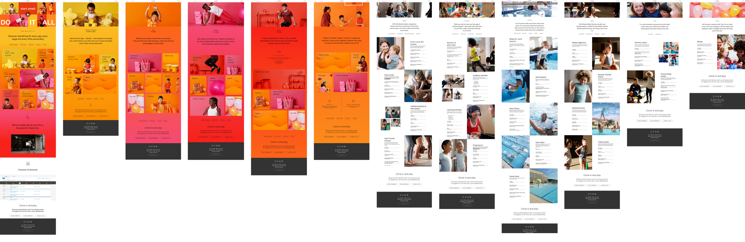
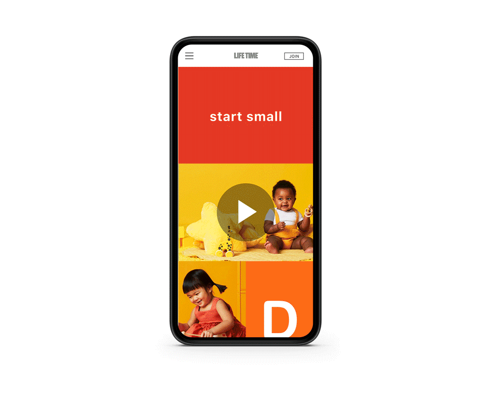
The redesigned Life Time Kids Prospect Website focuses on clarity, structure, and guided discovery. The primary goal was to help prospective members quickly understand what Life Time Kids offers—and how those offerings apply to their family—without feeling overwhelmed.
Start small,
do it all.


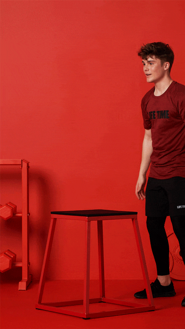
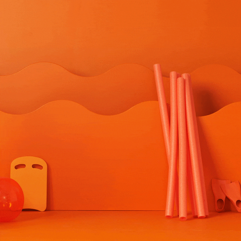
We started by creating a visual language
Part of the redesign included a highly stylized, colorful brand shoot designed to unify the wide range of Life Time Kids offerings into a cohesive, engaging experience.
The visuals play a key role in creating a seamless user journey—supporting complex content while highlighting the fun, energy, and family-focused spirit of the programming.

We worked with UX to create an experience that was built around:
Clear information hierarchy that groups programs by age first, allowing users to immediately self-identify
Intentional content grouping that separates included vs. paid offerings while still showing how they fit into the broader Life Time Kids ecosystem
Progressive disclosure, revealing details as users need them instead of presenting everything at once
Location-aware messaging, ensuring offerings feel relevant even when availability varies by club
Results:
The new experience transformed a dense, multi-layered program offering into a clear, approachable journey for prospective members. By prioritizing age-based navigation and progressive disclosure, the site makes it easier to understand program differences, value tiers, and location variability—helping families find relevant information faster while giving Life Time a scalable framework for future updates.